PRODUCT
Race Results Database
Live Publicly Accessible Web App
Development has continued so not all features match my design anymore
Business Context
Fix a bad redesign
New York Road Runners maintains a database of all race results going back to 1970. After a recent redesign of the system, users reported greater levels of frustration. My task was to tweak the design to allow for easier navigation of the site.
Research
Analytics
98% of traffic
was either on the day of a race or the day immediately following one
Analysis
UX Solutions
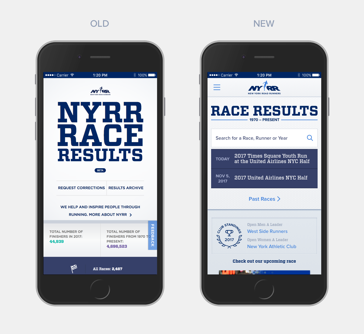
This layout improves upon the previous design where most major functions such as search, race listings and navigation items were hidden below the fold.
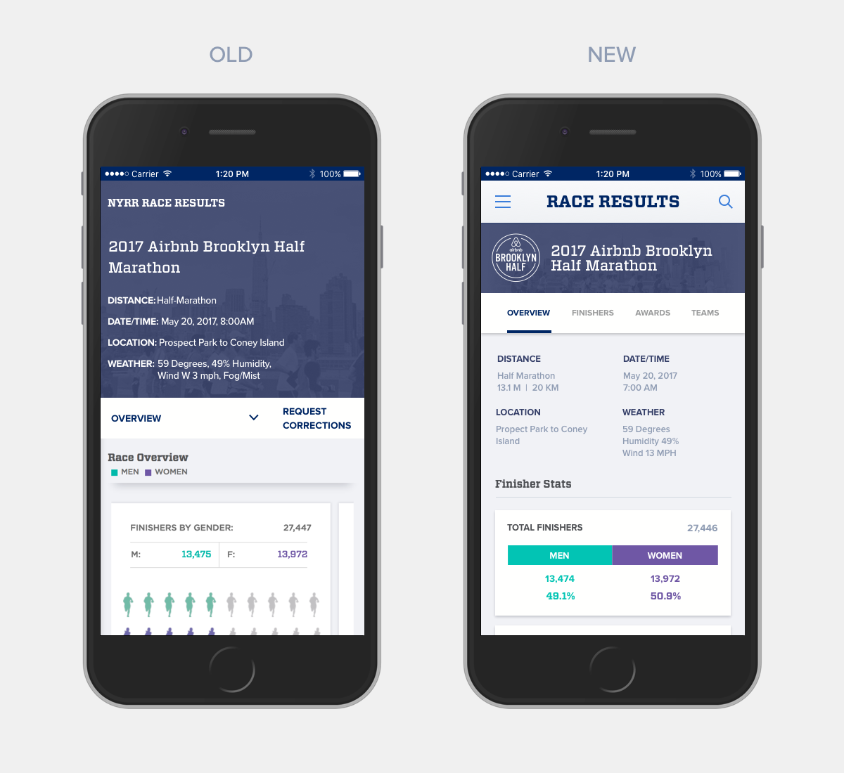
The race overview page allows quick confirmation of the navigational flow, while also displaying contextual stats about the race. By moving as much data as possible below the sub-header more area is freed up on the other tabs. Users frequently complained about understanding what to do on this page. To address this I changed sub-header from a dropdown to a tab style of navigation. Additionally, large illogical infographics where replaced with smaller simpler designs.
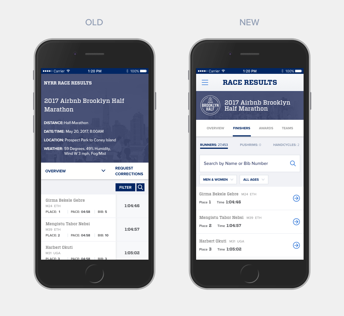
The list of finishers has been enhanced with more visible controls. Most users will search for themselves using the prominent search box. Those looking to filter or view results for wheelchair races will find those options more easily.
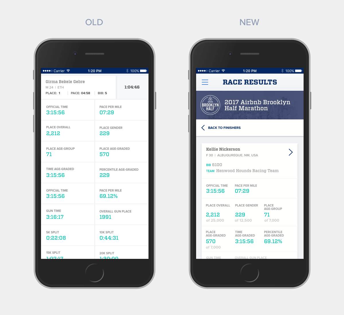
An individual's result used to function as an accordion, now it lives on it's own page. This allows for sharing, requesting corrections and a more predictable user experience.
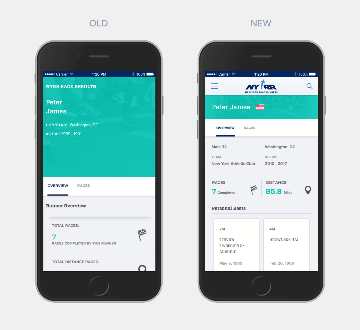
Wasted space is reduced and universal navigation eases the user flow.
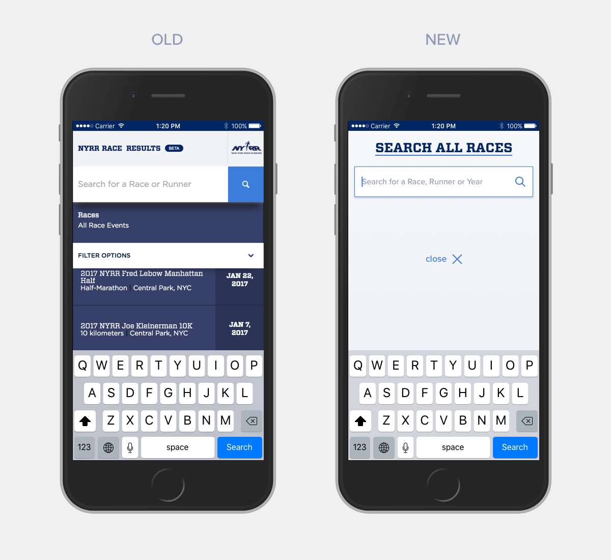
With options to perform a search from the header icon or from a search box on a page there were too many fractured search experiences. With a universal full screen popup all searches have the same UX.
