Live Publicly Accessible Prototype
Development is frozen so not all features are up to date
Business Context
Existing Product reaching end-of-life
Voyant's existing conferencing solution was bundled as part of a white-labelled reseller instance of Broadsoft Unified Communication (UCaaS), built and distributed by Cisco. The need for a replacement was escalated by Cisco ending support for self-hosted reseller instances in favor of cloud hosted, cutting out our margins. Different components of the application had different end-of-support road maps, the first to loose support was the conferencing component named Broadsoft Collaborate
A replacement for Broadsoft was paramount to the survival of the business. Voyant's reselling of Broadsoft accounted for almost 50% of our business, or roughly $30 million in annual revenue. Given the scale of the revenue it was decided that a full replacement UCaaS solution would be built.
Customer Attrition
The existing product's conferencing experience lacked in comparison to modern competitors. Customers were were supplementing our UCaaS product with outside party's conferencing solutions. Unified Communications is sold on the premise that it's the only product a company needs. Purchasing a different conferencing solution was a crack in the foundation of our UCaaS business.
Product Requirements
Modular Product
With a tight time frame product leadership decided to take a modular approach. In the short-term the application could live as a feature inside of Broadsoft with a Long-term transition plan to live inside our new in-house UCaaS solution. However, depending on the speed of our UCaaS developers we could have skipped the short-term plan. Finally the product team was leaning towards selling the application a stand-alone product.
Built on the Jitsi Meet Open-Source Platform
WebRTC
Jitsi Meet allows us to leverage their Web Real-Time Communications (WebRTC) front-end functionality, while transmitting audio in the back-end over our own telecom network.
Videobridge
Jitsi's Videobridge functionality allows us to quickly integrate camera and screenshare capabilities.
PSTN Dial-In via the Inteliquent Network
Leveraging our parent company's telecom network allows users would be able to dial-in via a traditional phone line.
Research
Goals
Optimize the in-conference experience
With no clear context on where conferencing should live, I directed the focus of my research on the commonalities between the possible product scenarios. Conferencing applications vary in how users are organized, how users are invited to and join a conference. However, in-conference experiences are consistent across different application contexts.
Formative Research Methodology
Without the financial or time resources to recruit external participants we asked our colleagues to fill is as research subjects.
Analysis
Insight: Camera usage increases meeting engagement
Insight: Users responded to social pressure to turn their cameras on
Insight: Users are distracted by their own camera feed
UX Solutions
Create spacial hierarchy to encourage camera use
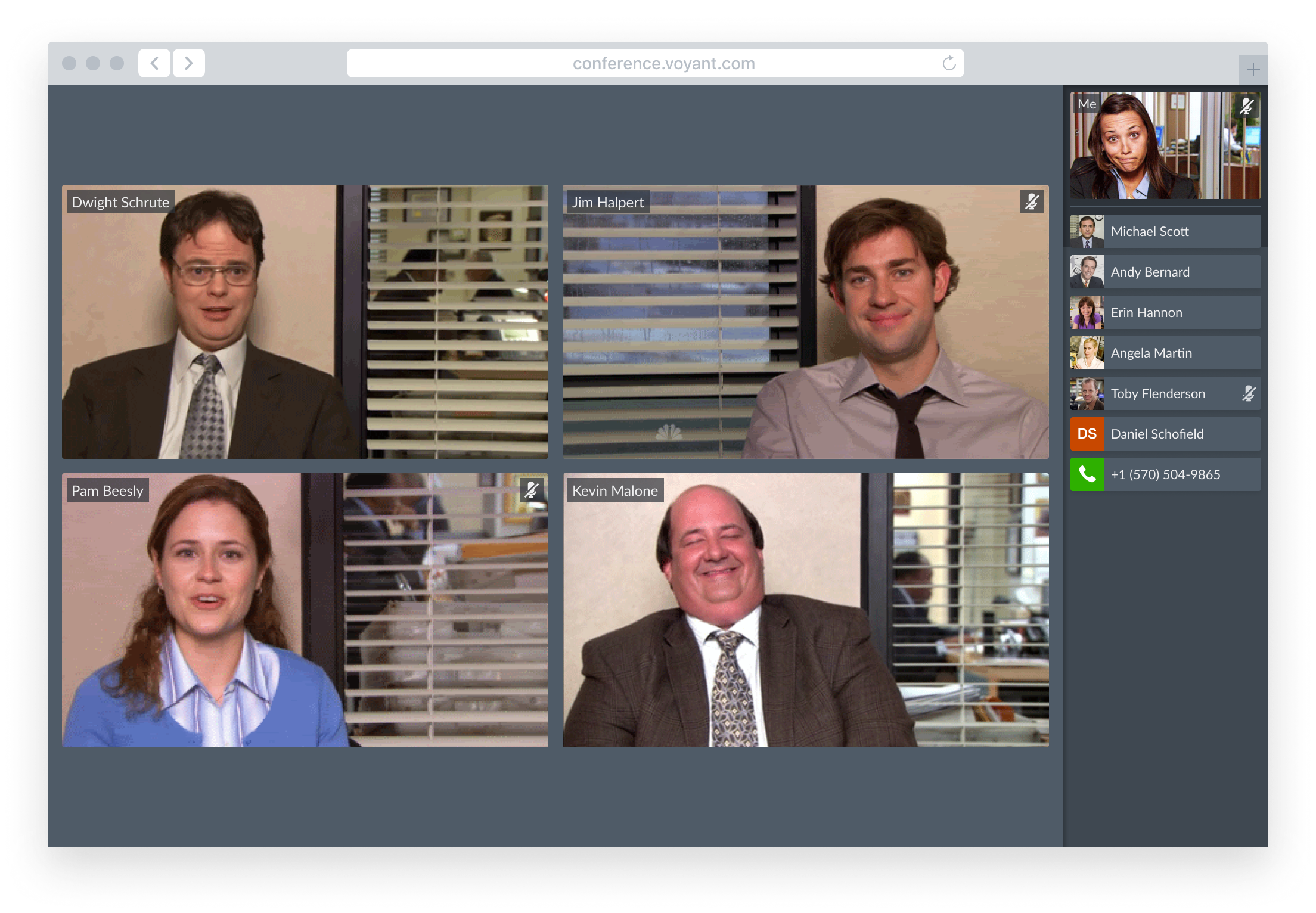
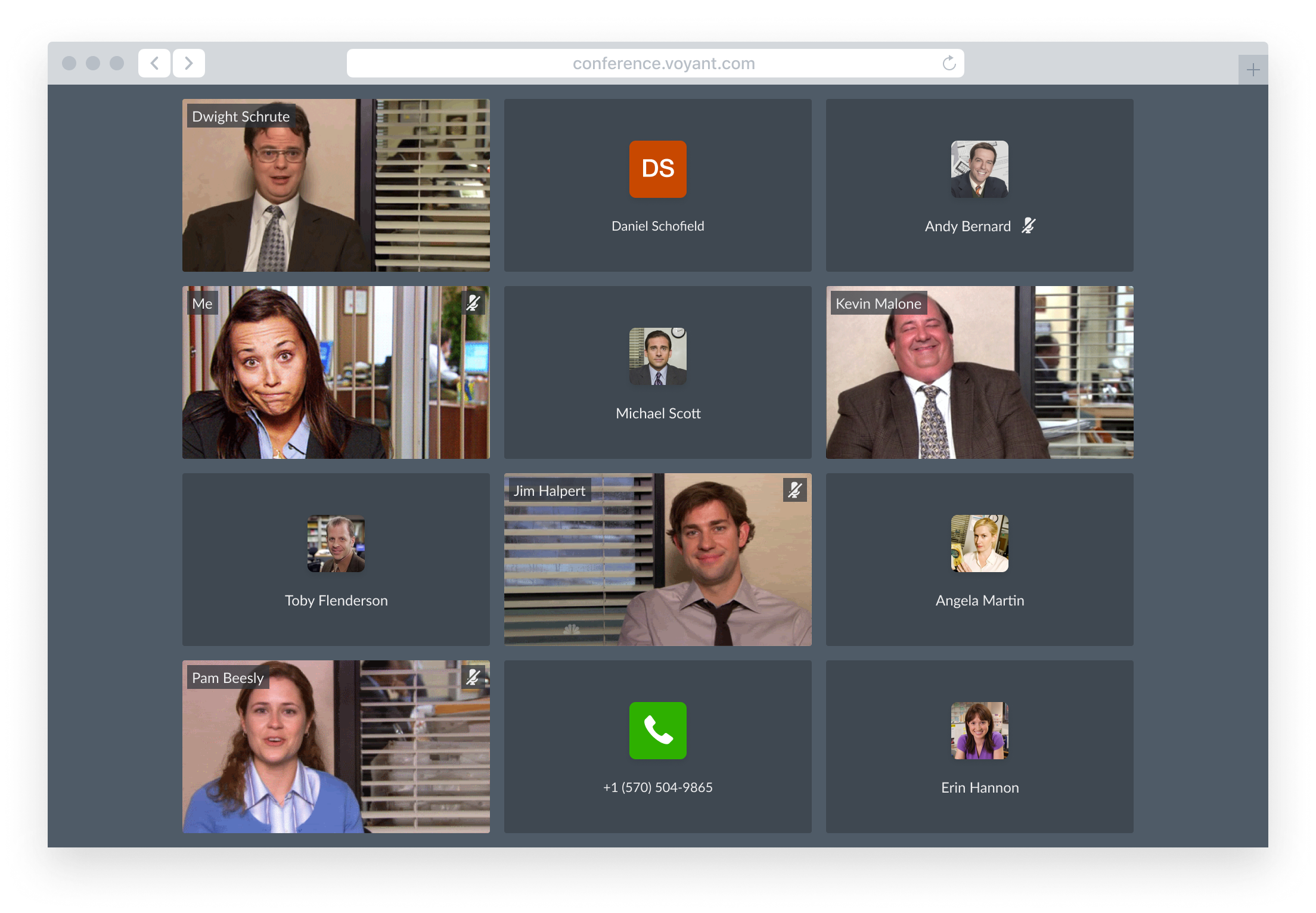
Layout Comparison
The ability read and project non-verbal communication across the room contributes to the ease of participation during in-person meetings.
Grid View
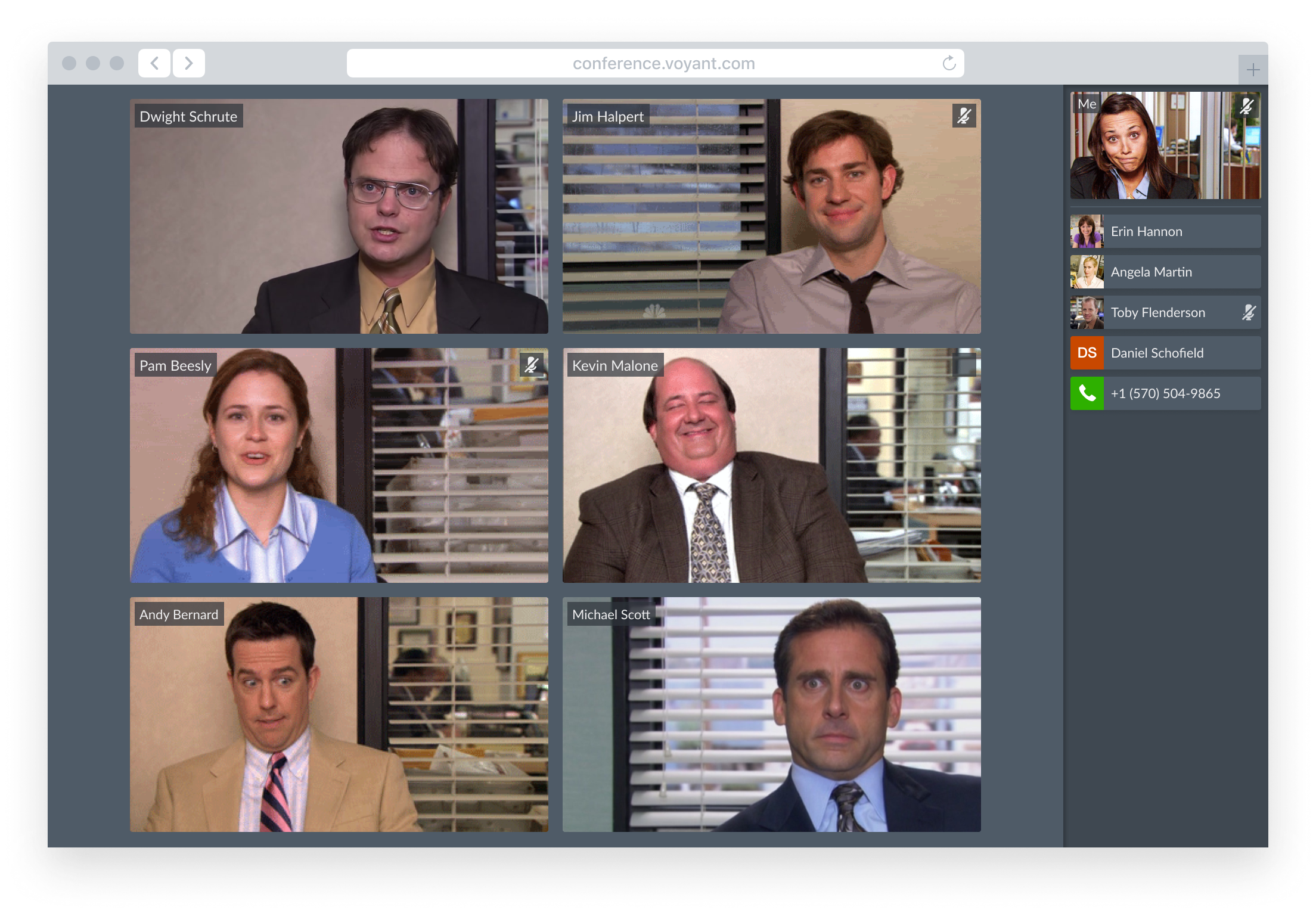
Active Speaker View

Call Controls
Validation Using Paper Prototype User Testing
- Your doorbell just rang
- Your spouse asked you a question
- Your kids are running around behind you.
- You're getting another call
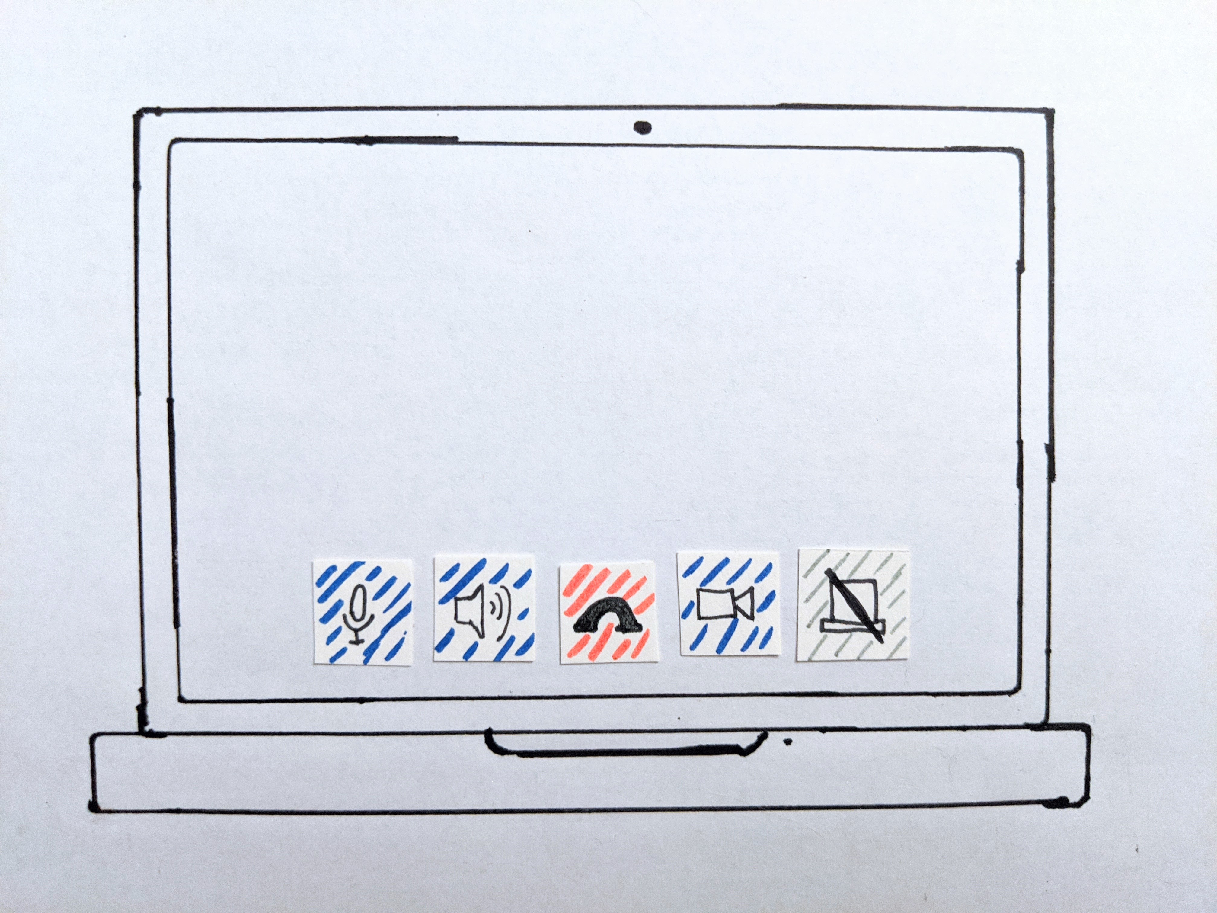
Comments from test users
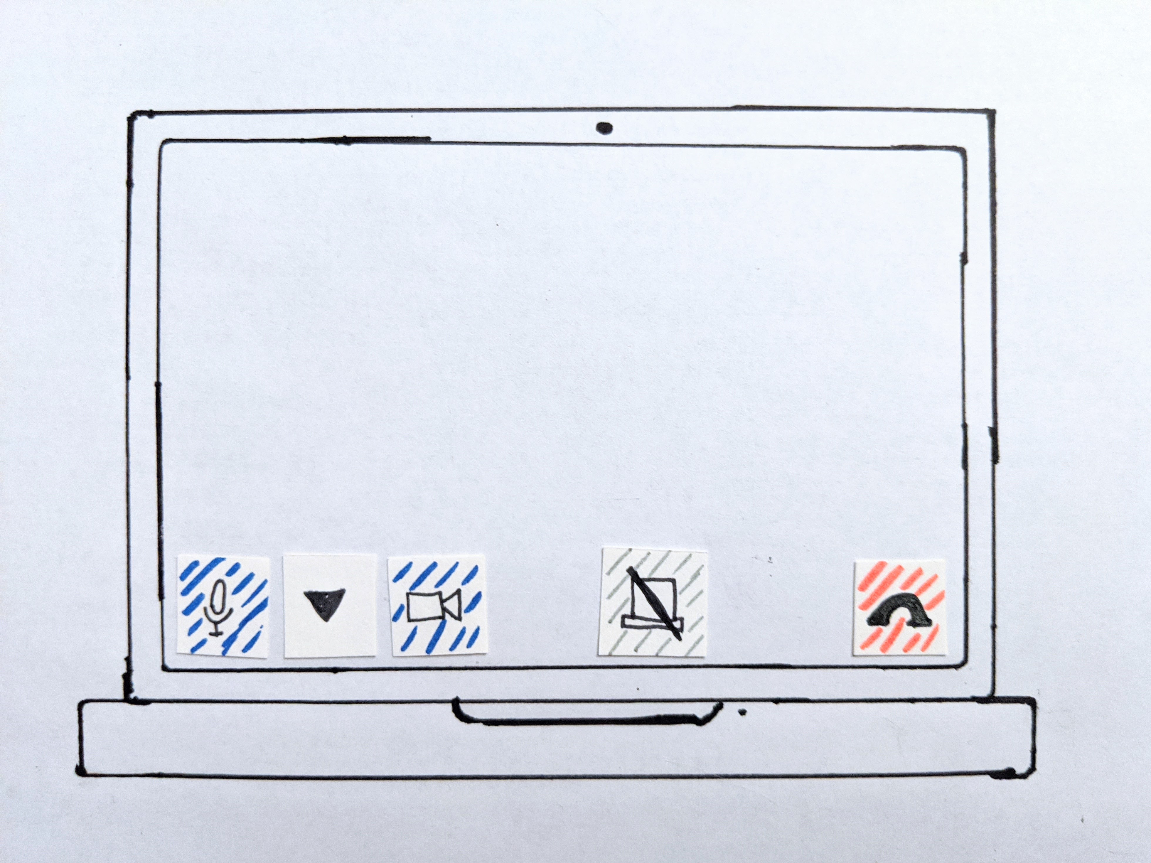
"I like how audio and video controls are divided"
Comments from test users
"It's not intuitive that the audio out controls are buried next to the microphone"
Example
Example
Pro
- Accounts for every situation
- Reduces clutter
- Have to include them anyway
- Easy implementation for MVP
- Scales easily as users switch between devices
Pro
- Can provide faster controls for common situations (examples: hold, transfer)
Con
- Can be slower due to multiple actions
Con
- Difficult to account for every situation
- Still need hardware controls
- Can be cluttered
- Doesn't scale easily across devices
Vanishing Interface
Conferencing interfaces can become very cluttered as features are added. However, the vast majority of participant's time is spent in conversation rather than using the controls. When the app detects no cursor movement it will hide the controls, allow the participant to concentrate on the conversation.

Dev Handoff
Speaking Indicator
This speaking indicator design works on both users in the video grid and users in the audio sidebar. It doesn't block anything by existing entirely in the margins between participants. It could react to volume and duration.
See the Pen Speaking Indicator by Michael Kronenberg (@mkronenberg) on CodePen.
Grid Optimization
Since CSS alone could not accomplish the task without potentially overflowing the container I created a formula to determine the most efficient arrangement
Objective
Find the grid arrangement with the largest area per item
Larger
Smaller
If two arrangements produce the same area per item choose the arrangement with the grid ratio closest to 1
Grid Ratio: 1
Grid Ratio: 1.5
Rules
The grid arrangement may not have a negative margin to neighboring elements on the page
Positive Margin
Negative Margin
Video feeds always maintain a 16∶9 ratio
Correct Aspect Ratio
Incorrect Aspect Ratio
